Facebook Ad images that deliver high conversions
Posted on November 6, 2019 (Last Updated: July 15, 2021)
Some advertising can be obnoxious, invasive and repetitive which is why many people are sick of ads. Did you know that over 25% of internet users are using some form of ad blocking tools?
Of course not all ads are equal, and while the general sentiment for ads may be negative, there are still many ads that are enjoyable and relevant - with some of the most memorable being those shown during the Super Bowl.
They make us laugh and associate positive emotions with their brand. They bring out fears and remind us how our worries would disappear with their service. Good ads make us feel and encourage us to act.
Even if your marketing budget isn’t equal to Super Bowl commercial air-time, there are still many ways to replicate success with your ads. In today’s blog post I’ll be discussing one of those ways - by improving your ad’s images to deliver high conversions through multiple strategies.
Create images that stand out
Think of how many times you’ve mindlessly scrolled through Facebook. Chances are you’ve passed through the majority of posts, especially the ads, without a second thought.
It’s the visuals that grab your attention while scrolling through the feed. If your image fails to catch the viewer’s attention, then they won’t read your copy. In order to reach people on Facebook, you’ll need to communicate visually. Here are some ways to immediately hook a viewer with just your image:
1. Color Vibrancy
Your choice of colors can be the difference between vibrance and monotonicity. Creating a vibrantly colored ad is a great way to capture a user’s attention and encourage them to engage with your ad.
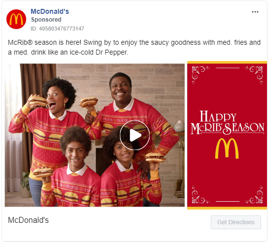
Here McDonald’s caught the user’s attention by using vibrant colors and by referencing the upcoming holiday season humorously (image above). By associating the holiday season and fun family gatherings to their McRib, McDonald’s influences the viewer to think positively about their sandwich.
Using contrasting colors is another great way to make your image stand out and is a method deployed by Zoho (image below).
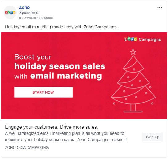 The contrasting white immediately stands out from the vibrant red and catches your attention while also allowing you to quickly understand the value Zoho provides. With the user’s attention drawn, they are much more likely to continue spending time to read the ad copy.
When selecting colors, it’s good to stay with your brand colors, and as with anything online - A/B test to see what works best.
2. Include people
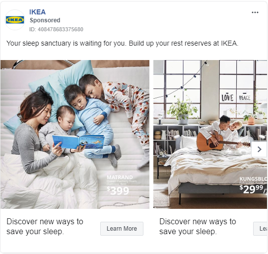
Including people in your image increases conversions, and quite significantly too. The data shows that the inclusion of people, especially happy ones, influences the psychological triggers of a person’s buying decision.
When we see happy people (image below), we’re more prone to trust the message and our eyes focus on the people in the image - improving engagement.
3. Relevancy in the image
If the image is relevant to the user, they’re much more likely to be drawn towards it. One of the best ways to ensure relevancy is through dynamic ads. If 9FIVE can achieve 3.8X return on ad spend through Facebook dynamic ads, then so can you.
Dynamic ads are so powerful because they’re designed for relevancy. Each ad viewer can see a unique image based on their interaction with your website. The more relevant the ad is for the user, the more likely they are to react favorably to it.
Of course, if you are using dynamic ads, remember to optimize your images. You can’t simply add a random, awkwardly sized image. Rather, make sure the image sells your product, is optimized in both color and size, and falls within Facebook’s image requirements - especially when it comes to text.
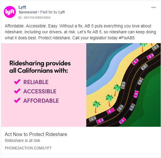
Another way to take advantage of relevancy is through location-specific ads. Location-specific Facebook ads allow you to target individuals living in specific geographical locations and and using an image that resonates with viewers in a specific location is a great way to grab their attention.
By incorporating location into your ad image (image below), you’re much more likely to grab the user’s attention. These people will immediately view the ad as being specifically relevant and be intrigued to learn more.
 4. Include CTA in the image
The call to action (CTA) is the action you would like your user to take, such as “buy”, “sign up”, or “get started” (image below). While it’s always included in landing pages and marketing emails, it’s often forgotten in image ads.
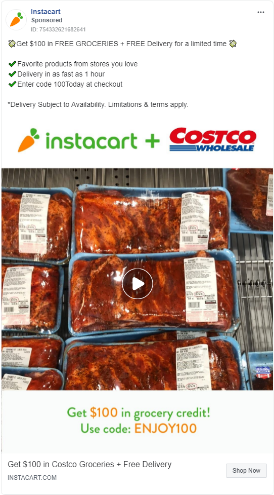
It’s important however for your image to actually be an image - and not be full of text. While designing your ad image to include the CTA can be a great way to ensure your value proposition is noticed, remember to stay within Facebook’s limits.
5. Display the benefit
The image will be the first thing your audience sees. As such, make sure it immediately communicates the value your company provides.
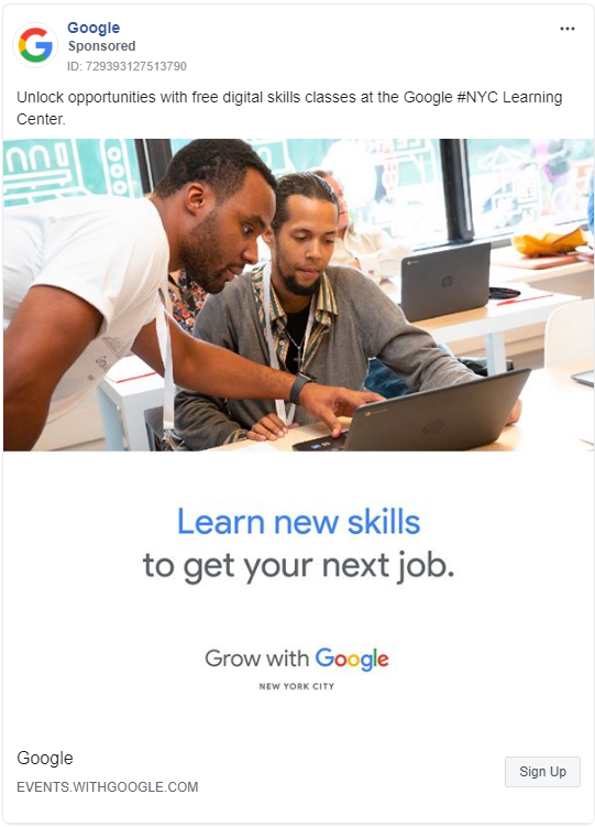
In this image by Google (source), it’s very apparent what the value proposition is - learn new skills. Those interested in learning new skills would immediately understand the ad’s purpose and and take action.
Conclusion
The image will often be the first thing the user sees when they encounter your Facebook ad. In order to stand out from the thousands of other ads your audience sees every month, consider the above strategies when designing the ad’s image to improve conversions.
When we review the above ad images, we can find some similarities and overlapping strategies:
- Solving a problem: Whether it be helping you improve your skills, providing you with comfort, or filling you with joy, the images were all presented as a solution to a problem.
- Driving an emotion: Emotions of desire were invoked in all of the images presented. The business owner will view the Zoho ad with a desire to boost their sales. The viewer will see the IKEA ad with the desire to sleep and relax. The shopper will desire mouthwatering groceries without having to take the time to drive and park in the busy Costco parking lots.
- Grabbing attention: Successful ads grab your attention, and the examples shown do this through vibrant colors, relevancy, and often with real people.
While simply combining all these strategies into one image may not work, as with anything in marketing, A/B test to see what works best for you.
As the image is one of the most important aspects of your ad, it’s important that you treat it as such and consider having it professionally designed. While there are many tools that allow you to easily edit images without professional design knowledge, you’ll most often end up with an output that looks just like that - unprofessional.
Author Bio
 Kenny Schumacher
Kenny is the founder of Delesign - a flat rate graphic design service helping hundreds of businesses. When he's not working, he enjoys staying active and playing with his parrot Mango. Connect with him on LinkedIn.

